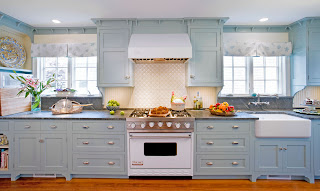
Beach Beauty: Fresh Kitchen Design Meets 1920’s Home
Maddison kitchen has a new look
It was a desperate need for working appliances that actually led this homeowner on a mission to remodel her kitchen. Although there had been a few updates to this 1920’s Madison beach front home, the time had come to tap into some hidden potential and bring the kitchen and sun porch into the 21st century.
 |
| "Before" image in much the same angle as above |
The porch had a fiber board drop ceiling which when removed showed that the original ceiling followed the roof line and was beadboard, replacing the ceiling following the roof line with new beadboard kept the space in the period of the home. A pale robin’s egg blue on the ceiling is reminiscent of sky and draws the eye through the space ties in the kitchen walls which are another shade of that same blue.
Wanting to take advantage of natural light, Ciccarello reworked theses spaces to create a cohesive plan, and a more casual feel. Door locations were changed to add much needed lineal feet to the stove wall. Opening the kitchen to the sun porch and dining rooms allows for beautiful sea views from each room. Soffits were removed and cabinets installed up to the ceiling, for more storage and visual elegance. Taller windows installed in the same opening bring in more light. Prior to this remodel the kitchen was dark and confining, even though the home owner is an avid cook with a love for taking cooking classes she hated to spend much time in the space. “It just was not a nice place to be” she says “it’s definitely a whole new house now, when you fix the kitchen, you get a whole new home”.
The old kitchen did not have an island. There was limited counter space which made it tough to entertain. The new island and counters are a custom fit at 1” higher than typical which helps alleviates back issues. The perimeter countertops are soapstone and the island countertop is made from hand chosen wormy butternut from old barn floor beams with a rain shield finish.
The layout and room flow is the customer’s favorite part of the space. “I thought I would miss the butler’s pantry but I don’t at all”, she says “I have not even filled all the new cabinets yet, the new space is so roomy!” She adds, “It’s easy to work in, I never feel “stuck” in the kitchen. I love the island and mother of pearl and porcelain back splash”. She listed a few more items she is happy to have…big drawers under the cook top, large double ovens with a tray divider in the cabinetry above. There is a convenient coffee station with milk, coffee filters and cups all in one spot, everything needed for that morning wake up all in one location.
The porch is now perfect for casual entertaining and is easily accessible. The table is so handy it feels like an eat-in kitchen. “I can line the grand kid’s highchairs up on the tile and not worry because it is so durable” says the home owner. The porch is family and grandkid friendly.
New radiant heat under both the kitchen wood floor and the porch tile floor adds warmth and keep the space comfortable. Now opened up, bright and pretty, the space regains freshness with the white cabinets set against blue paint. The color of each room works with the color of the adjacent room to create a timeless look.


This article is very good & informative.I have gain so much information from this blog.I like your blog.Thanks for the post.I am waiting for your new post.
ReplyDeletekitchen remodeling Birmingham, AL