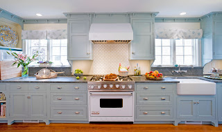
Bringing the Sunshine In
Photo credits to Caryn B Davis. www.carynbdavis.com
 |
| Burst of citrus brings the kitchen to life |
Outdated oak cabinets, a small island with a tiled top and
inadequate work surfaces were the impetuses these homeowners used to make
changes to their quaint Madison summer home.
With no true focal point and double entrances to the kitchen work space,
the original layout became a busy thoroughfare and did not give the chef of the
day enough space to create his or her signature dish. In order to remedy these design challenges
and drawing on their passion for color, the owners became inspired by an eye-catching,
pumpkin orange Viking 48 inch range that became the heart from which the new
look began to evolve.
“Cheerful” was at the top of the homeowner’s wish list as
was a more functional and spacious kitchen. The home is owned by 2 brothers and their wives
and summer draws a large crowd where relaxing and entertaining go hand in hand. Both families enjoy cooking, but the original
kitchen lacked work space for more than one chef at a time and did not have an efficient
traffic pattern or necessary amenities. The
new kitchen by Covenant Kitchens & Baths in Westbrook, is light and
spacious and has deliberate and practical design elements. Appliances are an integral part of the design
and along with the stunning orange range include the following in stainless
steel: 24” Sharp microwave drawer in the island, a Sub-Zero refrigerator, wine cooler,
under counter ice maker, and Asko dishwasher.
Closing one section of perimeter provided more work surface and made
walking into the kitchen an intentional decision rather than devoting kitchen
real estate for use as a walkway.
Vibrant Fiestaware featured in the space is the homeowner’s passion
and the new kitchen is equipped with the perfect open shelving to display some of
their sizable collection. The neutral
grays and whites of the surroundings facilitate an easy change of decor simply
by selecting other dishes.
 |
| Before: Cabinets were builders grade oak and counter tops were tile. |
 |
| After: White cabinets and grey accents are perfect with a pop of vibrant orange. |
White perimeter cabinets and a gray island function as a backdrop,
showcasing the pop of vibrant color and act as an anchor in the space. “People are sometimes afraid of committing to
color so the trick is how to use it,” says Kira Van Deusen of Covenant Kitchens
& Baths.
 |
| Before: Small window flanked by cabinets did not let in the sunlight |
 |
| Grey and white are the perfect neutrals and can create the back drop for most any color accessories |
 |
| Before: The space seemed dark and lacked a focal point. |
 |
| After: The Pumpkin Orange Viking range gave the room a great point of interest! |
Interest is created in several ways: through the use of
texture in the chosen materials, touches of beadboard, and honed granite and
tile keep the space interesting. The tile
covering the entire first floor was in great condition but there wasn’t enough
surplus to accommodate the kitchen floor renovation. To remedy this, Covenant’s designer chose a
gray textured wood-look plank tile for the floor and used a mosaic border
containing both the gray of the new kitchen tile and the beige of the existing
tile to create an ideal transition and define the kitchen space.
 |
| Wine storage and ice maker round out the amenities. |
 | ||
| Back splash and floor tile add textural interest. |
The backsplash tile containing circles of Carrara marble and
glass with three intentionally placed ceramic sea stars sets the beach tone and
plays well against the orange of the stove and wall. Bead board behind white open shelving that is painted
a shade lighter gray than the island gives more visible texture. Steel Gray granite perimeter tops provide a
great accent without being as harsh a contrast as black granite might have been.
 |
| It's all in the details, color and texture are paramount. |
The whole look was created to be happy, sunshine-filled and
reminiscent of summer days on the shore. The functionality of the room is
timeless.
Highlights:
·
Don’t overlook lighting, it is important to both
form and function and can be the jewelry of the room.
·
The use of a simple, beautiful door style helps keep
the cost down, yet does not sacrifice good looks.
·
Don’t underestimate using a mix of distinctly
different design elements. Modern and
classic materials work well together, from concrete to beadboard to marble,
stainless steel and punched tin.
·
Repeat design elements for continuity. Orange stove, orange painted accent
wall. White Carrara island top, White
Carrara in backsplash. Gray, black and
stainless accents.
·
Select an unusual palette of colors against a neutral
white or gray backdrop. Don’t be afraid to use a color you love.
Photo credits to Caryn B Davis. www.carynbdavis.com


we have direct access to stone of unmatched beauty and rarity and with over 25 years of building experience, in-house architect and a complete supply, design and installation service. We can then advise you on a suitable stone for your project, ensure the quality and therefore provide you the best value for your natural stone choice.
ReplyDeleteMarble Vanity Tops
Super designs i really liked it very much thanks for sharing these Modular kitchen designs.
ReplyDeletehttp://siravi-modular-kitchens.blogspot.in/2018/01/five-best-modular-kitchen-finishing.html