Case Study: "Trending Towards Contemporary" Clean crisp lines are anything but boring.....


Every design project has it’s challenges and this was no exception to the rule for the designers at Covenant Kitchens and Baths in Westbrook, CT. This Old Saybrook eclectic colonial style home is unassuming on the outside but the inside has taken a beautiful bent toward the home owner’s contemporary tastes.
The scope of this renovation was to gut and remodel the kitchen, powder room, master bath and a secondary bath. Upon its renovation the kitchen most definitely has become the focal point of the home.

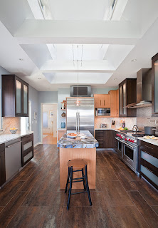
Angular and dated despite a bank of windows showcasing the view of the marsh, the kitchen seemed dim, small and cave-like. The homeowner wanted bigger appliances and a dramatic, contemporary look without changing the footprint of the kitchen or sacrificing storage space.

“Being able to make the room seem larger without increasing the footprint of the home was tripping us up for a bit.” says Ciccarello, owner of Covenant Kitchens and Baths. “We came up with the idea to vault the ceiling and add a clerestory with transom windows to give a feeling of spaciousness and a look that was better proportioned to handle the larger appliances” he added.

The ceiling, an often neglected surface, was vaulted with careful attention to the home’s exterior look. The clerestory immediately gave the inside space the dose of high drama that was desired by the home owner and some extra curb appeal from the exterior that was intentioned by the designer.

Form and function being equally important, a perfect cache of extra space was gained for storage in the kitchen by recessing a tall pantry cabinet with roll out shelves into a little used closet space in the powder room. Staggered open shelves add visual texture and a place for the homeowner to personalize their space.
Generous scale stainless steel appliances to suit the homeowner’s wish list grace the space with loads of functional amenities. Among their favorites are the six burner range with convenient potfiller, warming drawer in the island and wine chiller. The makings of a perfect party!

An avid reader of Architectural Digest, the homeowner fell in love with a counter top material he saw in an advertisement for Concetto stone by CaesarStone Quartz Surfaces. He brought the ad to Gerard Ciccarello and inquired about using this product. The material is hand-made from individually cut semi-precious stones that are bound with a semiclear epoxy binder. The homeowner favored the brown agate material. The binder and parts of the agates are translucent.
Ciccarello chose to back light the countertop (with fiber optic lights on a substrate beneath the stone) and use it as the pinnacle of the design.
The warm browns, golds and cool gray blues of the stone were pulled into the room by Covenant designer Kira Van Deusen. “It’s all about the contrast between lights and darks” says Van Deusen
Natural looking material and earthy tones of dusty gray-blues and warm browns with intense light and dark contrasts helped bridge the rift between the eclectic colonial exterior of the home and the contemporary lines of the new kitchen

“My favorite projects are the more contemporary projects, even though times have changed and contemporary is more common, these projects are still a departure from the norm here on the Connecticut shoreline”, said Van Deusen. “Recently we are seeing more and more projects like this one where we get to use the latest greatest materials, to me it is the equivalent of an artist discovering a brand new color”, she says, “more room for creativity”.
Previously outdated, dark and lacking drama this kitchen is now a sparkling updated masterpiece with personality plus! The homeowner is ecstatic about their space. They told us that they liked our portfolio photos but now nothing compares to their space.
“Sometimes a client can be afraid that contemporary can become dated more quickly but the truth is that it can be just as timeless as a more traditional style” says Ciccarello. “As long as there is attention to detail and a good solid design framework, a contemporary kitchen and bath can endure the test of time.”
Over the past 20 plus years that Covenant Kitchens and Baths has been designing along the shoreline they have witnessed first hand the turn from using all traditional elements towards cleaner lines, simpler door styles and one or two pieces that really impact the whole picture. There is also a trend toward mixing elements of styles that works well, too. It is not uncommon to see a more contemporary light fixture in a more traditional room. If the pieces are in the right color tones and right scale the sky is the limit!


Comments
Post a Comment